|
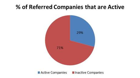
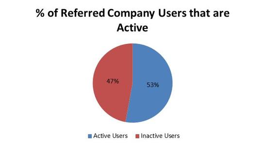
One of the keys to Yammer’s success was their focus on metrics, and tracking customer invites was one of the most important metrics. Yammer’s success relied on two types of customer invite virality: one, intracompany virality – when employees invite their colleagues to join the company network; and two, intercompany virality – when employees invite outside companies to sign up a new company network. Measuring the intracompany virality is pretty straight forward, but calculating the effectiveness of intercompany virality is quite a bit more complicated and will thus be the subject of this post. Why is it more complicated? Because you first have to measure how many intercompany invites spawn new networks and then you have to calculate how many new users join the new company networks. In the attached spreadsheet, you will find anonymized user and company data for a mobile social networking company. Using the domain names of corporate email addresses is an easy way to determine if an invite is intracompany or intercompany. In my analysis, for 1,000 users which were created via intercompany invite, roughly 30% of those users spawned new active company networks (they invited colleagues to join their new company network). Taking the analysis to the second step, each active company went on to invite 10 additional users (on average). Roughly half of these new intracompany invited users became active and engaged users. So what can we make of this analysis? In aggregate, of the 1,000 intercompany invites, 293 created new company networks which ultimately spawned 1,633 users. From here, you can calculate the marketing costs of the 1,000 intercompany referrals and accurately compare that cost to the customer lifetime value of the 1,633 active new users. If the CLV is higher than CAC, you can add more marketing fuel to the fire. So how do you accurately calculate CLV? Well…I’ll save that for another day. :)
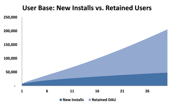
In the chart above, you can see that new installs as a % of the overall user base should decrease over time. The earnest hope for social and mobile app developers is that you drive initial installs through marketing, retain that user base over time and hope for viral word-of-mouth marketing to drive continued growth. After you’ve downloaded the spreadsheet below, take a few minutes to break down and understand the formula that calculates retained DAU. <Warning> It’s a pretty complicated formula. “Why would you make it so complicated?” Well, you could build out a waterfall table like you would for monthly retention, but that would get out-of-control in a hurry. And, let’s face it…I love making crazy formulas in excel. </Warning> In most cases, companies drive installs through SEM or other forms of pay for performance marketing. The other key assumption to play with in this model is the retention curve. You will ultimately want to forecast user retention based on historical data. How do you do that? Well…I’ll save that for another day. :) Forecasting user retention is hard enough for monthly subscriptions, but the problem becomes exponentially more difficult when you want to forecast daily retention. And quite frankly, social apps (like Zynga’s Farmville) and mobile games like Plants vs. Zombies really care about daily active users as that is what drives their revenue.
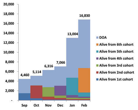
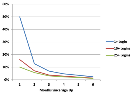
Congratulations, you’ve just acquired a customer. Now what? In traditional enterprise software, you would be done and move on to find the next customer. However, with today’s SaaS and freemium models, you need to focus more than ever on user experience and driving engagement. Why is engagement so important? Well, in monthly self-service subscriptions, customers can churn out just as quickly as they sign up, and in freemium models, customers can remain free forever if they aren’t engaged (and sometimes even if they are). Let’s examine the graph above. If you only looked at user counts, you’d see a nice up and to the right trajectory. Unfortunately, when you break the users down into monthly cohorts, you can see how difficult it is to build an engaged user base when customers are quickly losing engagement. It’s hard to tell by user counts, because in this case, the free users aren’t quitting, they are just inactive. Before you can begin testing and optimizing your product for engagement, you will need to build a dashboard to measure engagement. With this sort of a dashboard, you can track cohort engagement over time and tie improvements to engagement to changes in product. The spreadsheet below contains both of these dashboards plus the formulas to build them from the raw user data. After you’ve put in your data, you should begin testing ways to keep your customers engaged and bring back inactive users. In the beginning, you may not have enough data points to create meaningful curves. You can actually extrapolate curves from as little as 3 months worth of data. How you ask? Well…I’ll save that for another day. :)
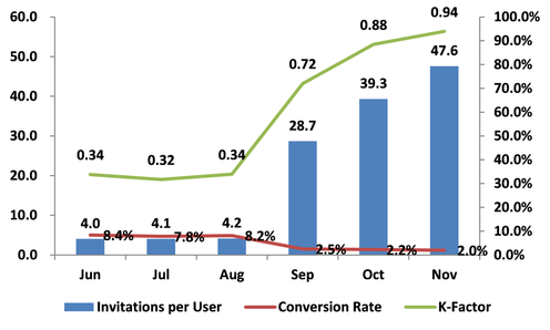
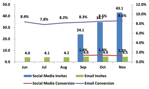
The Holy Grail of viral marketing is achieving a K-Factor > 1. This implies that every new user brings more than one additional user. Of course, achieving a K-Factor > 1 is not easy. Dropbox was able to do it through product invitations and early Facebook games accomplished the feat through merciless spamming. The end result of a high K-Factor is that your user count explodes, your marginal customer acquisition cost falls to zero and VCs start stalking you. Invites are up and K-Factor is exploding toward 1. Good news, right? Well, conversion rates have decreased so maybe we aren’t seeing the complete picture. After all, not all K-Factors are created equal and you as the entrepreneur need to understand how to decompose K-Factor into its components and how to optimize each component to best meet your goal. The spreadsheet at the end of the article shows how you can easily process raw user data into invitation funnels. These invitation funnels and their corresponding K-Factors are displayed below:
|
Sign Up to Receive Posts via Email
All
|
||||||||||||||||||||||||
